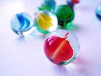
 It is a pleasure to work with so many supplies in a variety of colors. Not only do beads come in a rainbow of colors and finishes, so much so that you need a class to identify them all, but metal wire, beading wire, components all have colors and finishes that provide and endless number of combinations with which to work.
Sometimes having that many options at your disposal can paralyze your creativity in putting them together. There are some combinations that are intuitive, and you can easily drift off into creating with them. The true challenge is to put some colors together that are not classic combos, and see what you come up with.
There is a bunch of information on color theory out there, if you aren't already familiar with it. Even if you have the basics down, learning about Near Complementary Color Schemes or Square Tredatic Color Schemes is amazing. There are some wonderful articles out there for jewelry designers at the Beading Design Jewelry site.
Some colors I find easy to work with are black/white, black/silver, pink/purple, and black/red. But to grow as a designer and an artist, you sometimes have to leave the comfort zone and do something crazy. For me, dabbling in citrus and tropical colors can be daunting. Oranges, yellows, a bit of blue and red...oh my!

3 comments:
Very well put, I have to agree that color combinations make it difficult to design sometimes because of how many different ways you can do it.
So true and thanks for the link. I had visited that site before and really liked it but lost the link.
Oh I know, I hate losing track of links that I like. I'm glad I was able to help you with that link.
Post a Comment